Reading electronic books on the iPhone may not be as easy on the eyes as reading it on a dedicated eBook or reading a paper book. But, c’mon. The iPhone fits in your pocket. Plus, you were already going to be carrying it anyway, right? The iPhone and eBooks were made for each other.
Here’s what eReader (v2.0.2) has over the Kindle app (v1.0).
Options, options, options
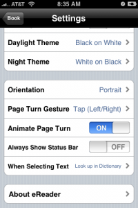
 In eReader, you can tweak your font, your font size, your line spacing, your margins, and your justification. On the Kindle app, you can pick your font size, but you are stuck with their font, their line spacing, their margins, and their justification. Even worse, the insets and tables in the text will only display completely when you use the Kindle app’s smallest font size.
In eReader, you can lock the display in Portrait mode, Upside-down Portrait mode, Landscape mode with up on the left, or Landscape mode with up on the right. You can even let it track your orientation if you prefer. On the Kindle app, you’re in Portrait mode.
In eReader, you can choose to turn pages by swiping them horizontally, swiping them vertically, tapping left or right, or tapping high or low. In the Kindle app, you have to swipe horizontally to change pages. eReader’s tapping modes let you read easily with one hand. Trying to swipe pages with the thumb of the hand holding the iPhone is fraught with misfires—accidentally not turning the page, accidentally turning back a page instead of forward, dropping the phone, etc.
eReader also lets you choose your color scheme. The Kindle app locks you into black text on a white background. Actually, I feel like I once found an option to switch the Kindle app to white text on a black background, but I can’t find it today.
Searches
What’s the biggest advantage of eBooks over paper? They are electronic. Because they are electronic, you can fit two thousand of them in your pocket, you don’t have to kill any trees, and you can search for text in them. The Kindle app forgot about that last bit. I am sure there are indexes in the print versions of the Kindle books that I own. But, in the Kindle versions, there is no index and no way to search. The only navigation is page at a time or table of contents.
I have the King James Bible and the Constitution of the United States in eReader. Because of that, I can always zoom right to the spot someone’s talking about. When I’m trying to refer to something in one of the Kindle books, I end up guessing by chapter title, swiping, swiping, swiping, and scanning with my eyes to find the data I seek. Seriously?
Dictionaries
I am reading along, reading along, reading along. All of the sudden, in the middle of the text, there it is: soliped
. What is that? How did it get into this book?
In eReader, I tap on the word and it looks it up in my Pocket Oxford English Dictionary. The Kindle app makes me fumble for a paper dictionary, go search an online dictionary, or pretend I never saw the word.
Thumbed Bookshelf
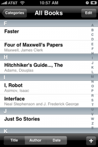
 I have 42 eBooks in eReader. I have 3 eBooks in the Kindle app. In either app, I can sort by title or author. eReader adds separators in the display to mark off each starting letter. With that, I can find one of my 42 eReader titles as easily as I can find one of my 3 Kindle selections.
Hopefully the next version of the Kindle app will address some of these things.


