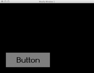
Inspired by the previous TC Lispers meeting and spurred on by the probable topic of the next TC Lispers meeting, I have spent the little bit of coding time I’ve had over the past two weeks on making a GUI layer using Sheeple atop CL-OpenGL and employing ZPB-TTF for font-loading.
I have dubbed this project Woolly
(because it’s made from Sheeple and because Woolly
sounds sorta like GUI
).
 I spent about half of my coding time so far getting the basic framework in place (proven through clickable buttons with labels). I am trying to keep it cleanly separated between generic GUI stuff and the CL-OpenGL specifics in the event that someone would like to port it to some other I/O spec.
The other half of my coding time was spent getting the font-rendering to be anti-aliased. I promise to write more about how I accomplished the font-rendering in a future post so that if you’re ever stuck rendering fonts in OpenGL, you won’t be stuck with pixelated blockiness or resorting to rendering to a texture-map and letting the mipmapper figure it out.
For this post, however, I’ll just show you the code that sets up the interface depicted here.
(asdf:operate 'asdf:load-op 'woolly-gl :verbose nil)
;; make it easier to change renderer/controller later
(rename-package 'woolly-gl 'toolkit)
(defun test ()
(let ((font (sheeple:object :parents toolkit:=font=
:em-size 48
:pathname "okolaks/okolaksRegular.ttf")))
(let ((app (sheeple:object :parents toolkit:=app=))
(win (sheeple:object :parents toolkit:=window=
:title "Woolly Window 1"
:width 640
:height 480))
(but (sheeple:object :parents toolkit:=button=
:offset-x 40
:offset-y 40
:width 300
:height 100
:font font
:label "Button")))
(woolly:display-window win)
(woolly:add win but)
(woolly:main-loop app)
(woolly:destroy-window win))))
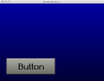
Next up on my agenda is to make the background and button prettier. It should be easy enough to do with GL_LIGHTING and some vertex-coloring for gradations. After that, it’s on to more controls like labels, panels, checkboxes, drop-downs, borders, and (my dread) text input boxes. Then, it’s on to a layout manager.
 Edit: Here’s the same GUI a day later. I’m using a simple lighting scheme and rendering the button in 3D. I haven’t yet hooked in the bit to render it depressed when the button is pressed. I’ve tested the code that draws it the other way, but I haven’t hooked it into the mouse handlers yet.
Edit #2: Actually, it only took a few minutes for me to hook in the rendering it pressed vs. unpressed. When I did it though, it looked like the label was sliding around because the effect of the contrast between the light and dark edges of the button was so great that you perceive the whole button sliding when it’s pressed. So, I added a little bit in there to actually slide the text by an amount close to what is perceived. So, now… it looks pretty spiffy.

I probably should have added this somewhere before the call to as an example of how to catch when the button was pressed.
(when (sheeple:call-next-reply)
(format t "BUTTON CLICKED!~%")
t))
I will probably make a separate Sheeple message for so this could be a one-line method instead of a funky thing.
And, before release, I promise to make those names more lispy: e.g. and .
You might want to look at what I’ve been doing with Until It Dies. It’s meant to be more of a 2d game engine, but I wrap a bunch of stuff to make this kind of OpenGL drawing relatively simple (at least as far as I know how to). For fonts, I’m just hooking up to ftgl, which made the process pretty painless, although I’m not sure how great a decision that is in the long run…
You can check out a (right now, extremely bloated) example of how it works here.
Anyways, anything having to do with easy-to-use GUIs in lisp sounds like a great idea. I’ve been tempted now and then to try and write something like Inertia, too, which would be quite nice for development in general…