For some time, I’ve been wanting to find some big data source to dig around in and make plots of. Yesterday, I realized that I have access to #lisp logs from IRC going back several years.
The first question that I wanted to look at was: How well does talkativeness on IRC follow a Power Law?
It looks pretty close when you’re looking at the raw data if you limit yourself to the top 100 to 300 people. Once you get up near the top 500 people, the best-fit curve really skyrockets way through the roof. There are just tons of speakers who have said one or two lines in the given time period. And, I made no effort to track lurkers so I have no zeros in my data set.
Here is a plot of the top 250 speakers (ranked by lines spoken). stassats is the leader, followed by pjb, then H4ns, then Xach. I made a best-effort to collate different handles for the same person (e.g. Xach_ vs. Xach). The least-squares, best-fit power-law curve here is 
stassats to talk more than twice as much. If you’d like to know how much more (or less) you should talk, drop me a note. 🙂
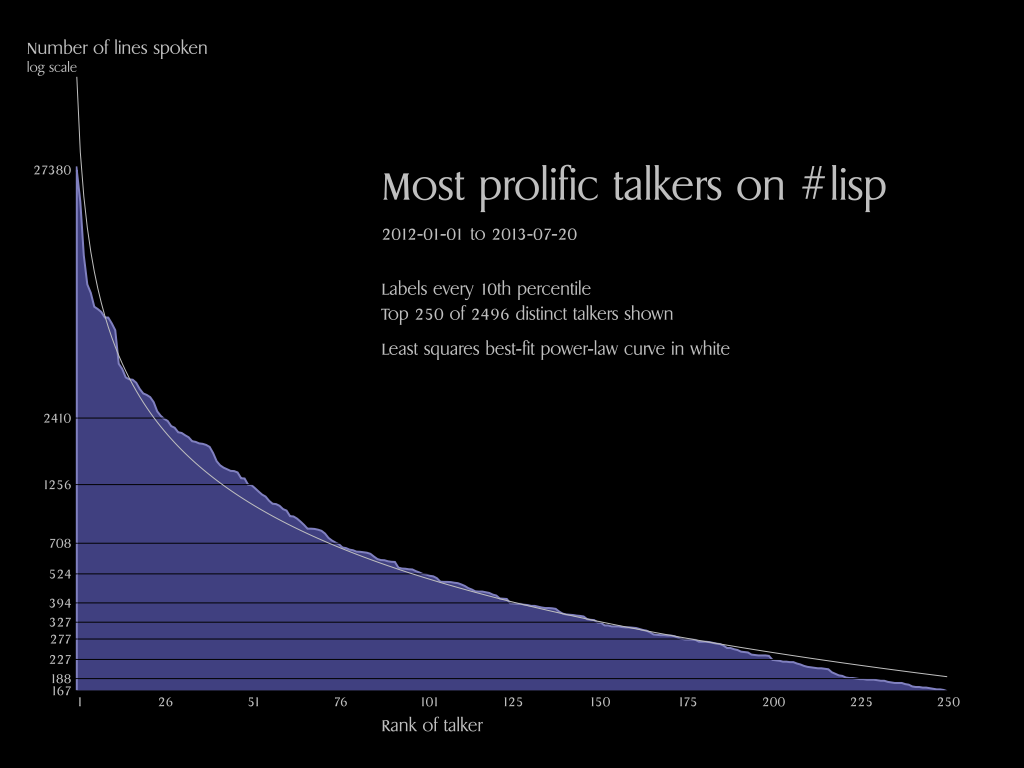
Click on the image above for the full-size version. I used optima.ppcre to read the log files and vecto to draw the graph. Here is the relevant source code: package.lisp, read.lisp, and power.lisp.
That’s interesting 🙂
If you want other ideas for big data to dig around and make plots, there are cl-test-grid results. We now have considerable history of test results.
I am thinking about some quality metric – a single number representing (approximately) quality of CL ecosystem at particular point of time. If we have such a metric, we could build a graph and find our, whether CL is improving or not, and how fast.
The metric could be something like number of tests/number of failed tests or similar.
I have been thinking of using cl-test-grid results sometime, too. I like the idea of trying to summarize or visualize improvement over time.
I like the idea of a single number for the whole ecosystem, but I also like the idea of finding ways to cram as much data as possible into a single chart to let one plumb the depths.
I made a chart showing activity by hour for IRC in 2008:
http://xach.com/charts/l.html
Nicks are colored based on the hour of the highest activity for that individual, with three different groups, 7-14, 15-22, 23-6. Code is at https://github.com/xach/wormtrails/blob/master/irc.lisp
Note that least-squares is demonstrably the worst way of fitting power laws. See http://arxiv.org/abs/0706.1062. tl;dr use a maximum likelihood estimator for the power law exponent, do bootstrap resampling to determine goodness of fit
Thank you… I will read that today…